Portfolio
Home Depot: Benefits Platform with AI
Brief
UX Design Manager
Company
bswift / Aetna / CVS Health
Date
2020 - Current
Web Application
Methodology
Mobile-First
Atomic Design
Design Guide
Workshopping
Prototyping
Business Development & Strategy
Objective
Home Depot has A LOT of employees. Just like snowflakes, no 2 are alike. They are all ages - some aren't of age to work in the U.S. and have permits, some are on Medicare. The goal of this project was to make a singular platform that adheres to this massive workforce.What we created was a data-driven platform that was a benefits portal as well as a daily "at work" source for work milestones, hours-logging and about 3 dozen other data points that provided information to the user across their entire career at Home Depot. Couple that with the Emma AI that would know more about each individual employee in under a second than any human HR rep could possibly know without a lot of time and digging around.
Goals:
- Teach 400,000+ employees about their benefits
- Help them all make good decisions for themeselves and family
- Cut down on HR call center calls
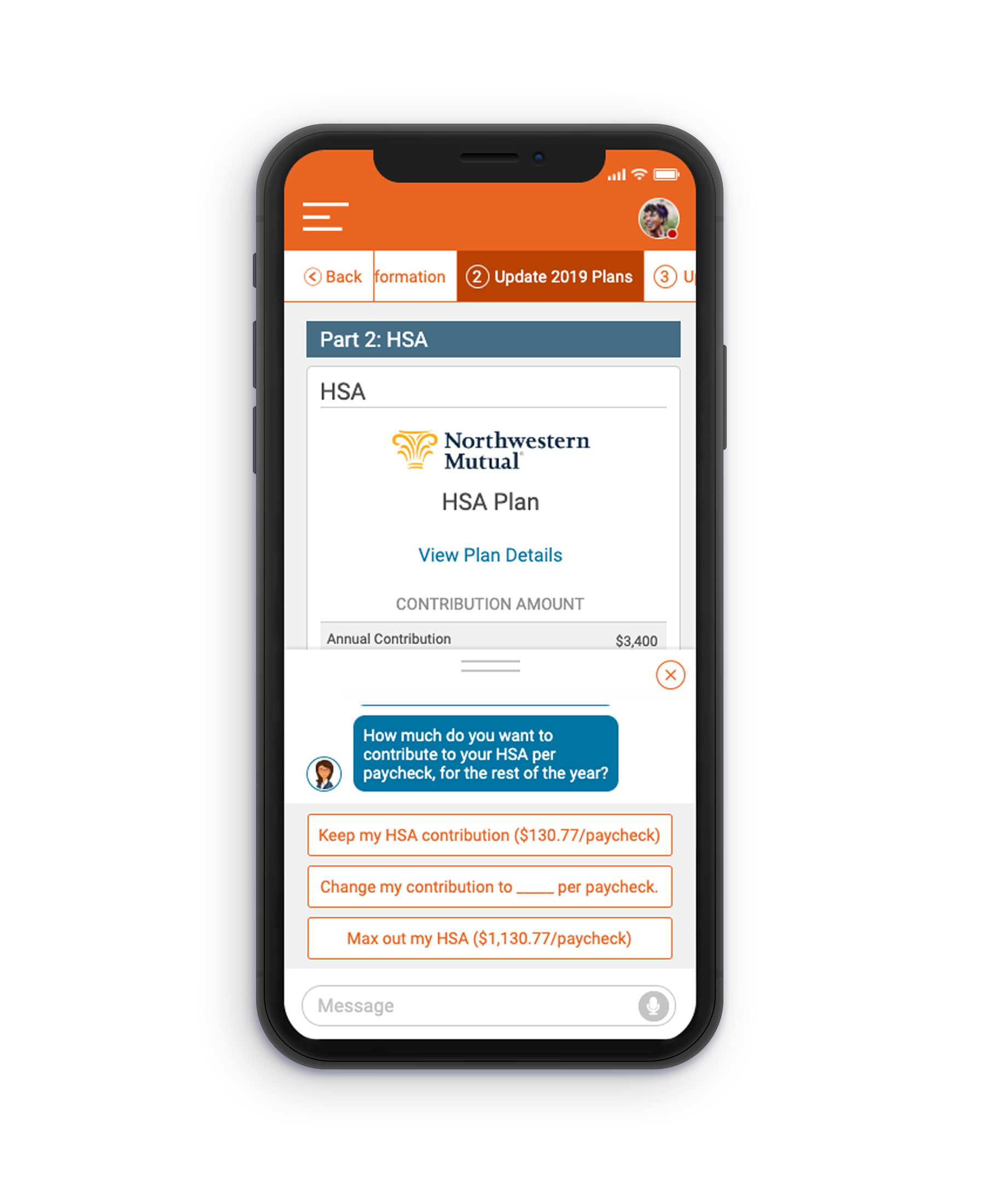
The pitch idea we went with was "Next Best Action". It's a bit of helpful guided education, and a lot of gamification and user enticement, and surrounding all of it was an integrated AI that is there to help make good health choices, then execute on decisions without the need to go out to all the partner sites or phone the call center / HR department.
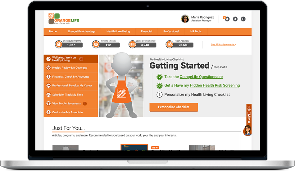
 User's first login - first actions learned
 User is now enrolled in health programs
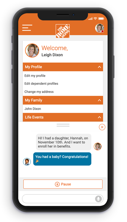
 User interacting with chat AI
What you're seeing here are conceptual, pitch designs created for us to explain and show what is possible with the data we have, and with the technologies available to us (APIs, AI, etc.). We did win the gig, and are in the discovery and early workshop stage as I'm writing this, so know that these rough prototypes and designs are vapourware. They are actually presently in the discovery / design phases, pre development.
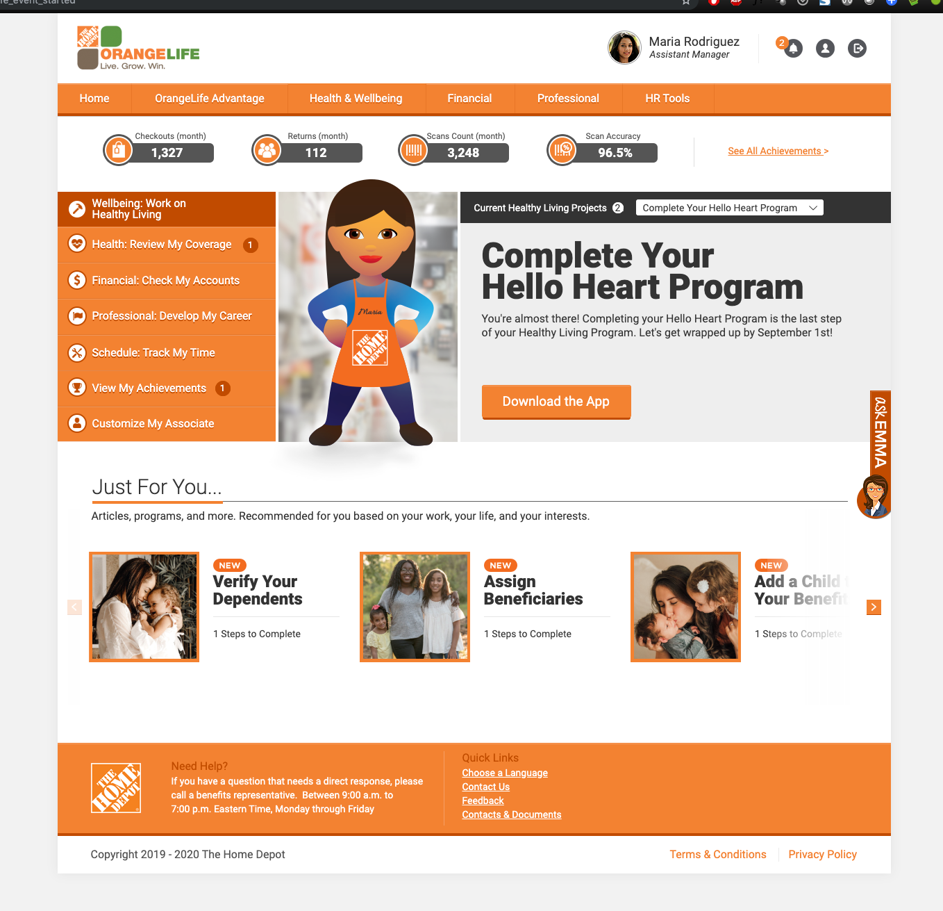
The story however is one we are following for the experience. First, the employee logs in, and right away they get an idea of the page's capability, but items on the page are unavailable to them because information is needed from the user first. They are prompted to compete 3 items to unlock new items. What we call the "Next Best Action".
They complete the necessary assessment as is a first requirement for using the tool, and then actions / programs in the bottom carousels are unlocked. In the scenario above, the user first does the assessment, and then customizes their avatar. Again, this is conceptual only, so of course we would do a lot of work on the avatar or anything similar to make sure it was flushed out.
 User tells AI about new child
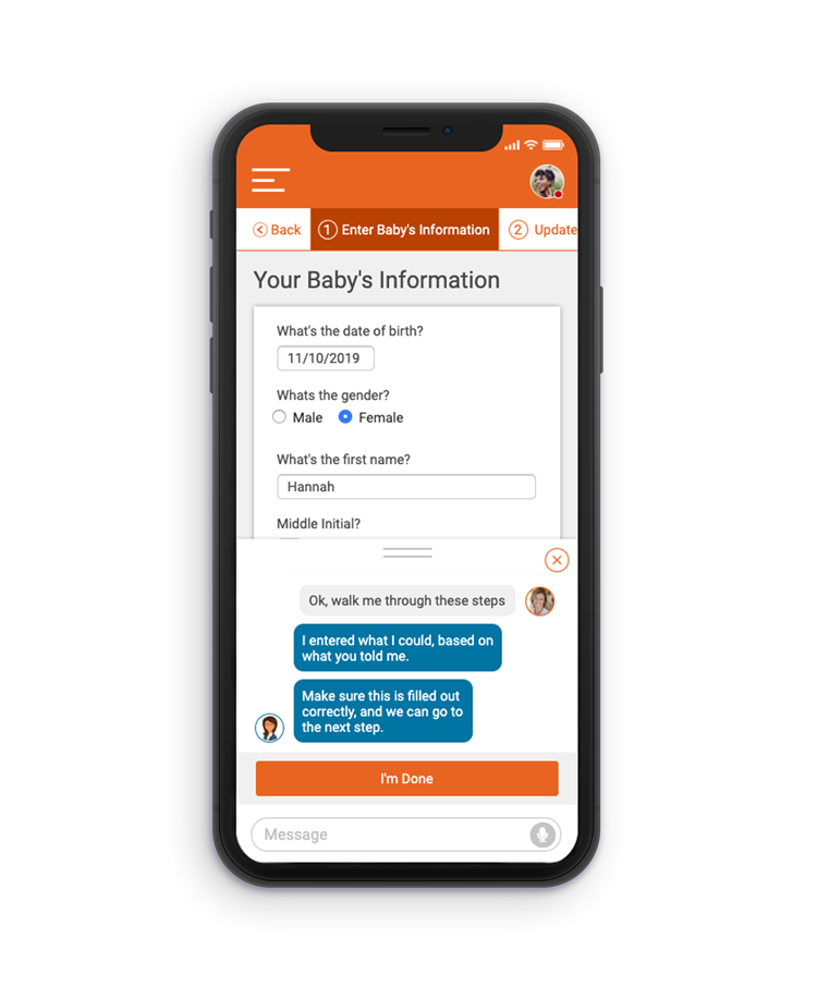 AI directs the user to where to add dependents
 AI makes suggestions on plans
Above is the pitch-based mobile expereince concept for after the user has told the AI chat that they had a baby, and is taking the next steps of adding that new child as a dependent in their benefits - all through dialogs with the chat AI. The chat AI even knew to pre-fill form elements based on conversational details given by the user (the baby's name is Hannah)
Process
Following our standardized team design process, we started with a discovery step which included interviewing the client, collecting a group of representatives and business spokespeople to conduct a workshop with. The workshop drives the direction and builds the foundation for what pain points and features to build towards. Personas are created to meet the user types learned about in the workshop and the design phase begins.Starting with sketches and wireframes we ideated on portions of the UI featuring the features and set the pain points as goals to overcome. Empathizing with the personas created, we put ourselves in their place and act as them going through the ideation, playing devil's advocate to see if pain points were elievated, and at the same time finding how they'd find new features. The report of this execise was shared with the client along with the early sketches and wireframes.
The next iteration upped the fidelity and polishing of the original sketches with included updates found from early exercises. This came as a clickable prototype that was used for our first round of testing with end users. The results of the testing was used to make changes to the prototype and apply them to the next level of fidelity. This was again tested, and a final round of iterations was made to the base and features, and the product was prepped for development. Development prep was done by taking the final prototype and writing specifications for all screens, animations and interactions. This UX / UI guide is handed off and used as a development tool and raleway to creating the final product.
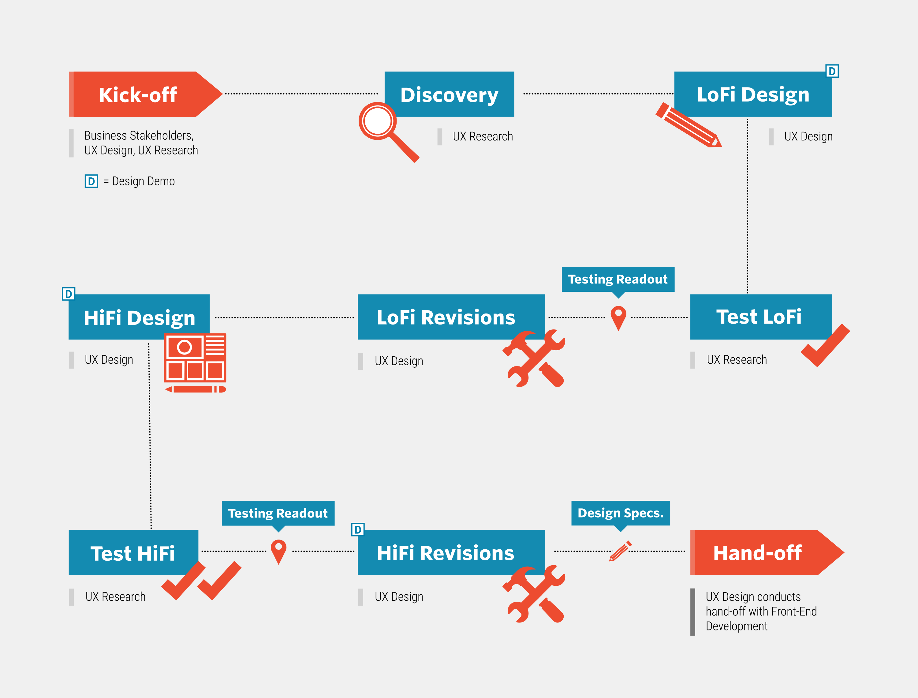 My Team's Design Process